Simulators
A calculation simulator is an online service made available to a user to enable them to calculate the results (taxes, social benefits, etc.) corresponding to their particular situation.
The results are calculated on the basis of data supplied by the user, reference data (e.g. amount of a tax) and business rules reflecting the current legislation in the field of simulation.
Creating simulators is reserved for users with the « Manager », « Administrator » or « Super Administrator » role.
Before you begin
Before starting to enter the simulator, think carefully about the simulation scenario, that is, its step-by-step division and their sequence. A simulation step corresponds to a page and vice versa.
In each page, it is necessary to define the information that will be requested from the user (via a form) and those that are restituted to him. A page may also contain blocks of information.
The information returned is either reference data or data from the result of a calculation according to calculation rules (legislation).
It is therefore necessary to make an inventory of all these data:
- Data entered by the user
- Reference data (e.g. amount of SMIC, RSA, ceiling safety, various scales, ...)
- Data from a calculation
- Data resulting from an intermediate calculation.
For the reference data, the question of the data source must be asked. Is there an internal or external web service API or a database to retrieve these data?
If so, it will be possible to set this API or this database in G6K to be able to access it.
Otherwise, it will be necessary to create an internal data source (database) in G6K. Note that simple values (such as the amount of the RSA) can be set constantly in the simulator, thus avoiding the creation of a data source. On the other hand, complex data structures (such as a scale) require the creation of an internal data source.
Then, it is advisable to identify all the elements of a page, name them, label them:
- Give a name to the simulator, the one that will appear in the url
- Give a title to the simulator. This title will appear on each page underneath the breadcrumb navigation.
- Define a hat description that will appear on each page of the simulation below the title
- For each step:
- Give a short name to the step and a label (not too long). The short name will appear in the breadcrumb sequence.
- Define the information (fields) that will be requested or restored to the user
- For each field:
- Give it a name and label (label)
- Assign a type (date, integer, amount, percentage, choice list, ...)
- Describe the field (this description can be used as a tooltip)
- Describe the conditions ^1^ to display the field
- Define its use (user input or restitution)
- If this is an input field:
- Define input controls and associated error messages.
- Possibly define a statement that may appear above or below the input field.
- If it is a field of restitution:
- Define the rules for establishing the value of the field (calculation, data source, ...)
- Possibly define footnotes and conditions ^1^ of their display.
- Define navigation buttons between the steps (next step, previous, new simulation, jump to step N) and their display condition.
Creating a data source
If you need a reference data source and it does not yet exist, you must create it before creating the simulator.
Refer to « Data Sources management » in the documentation.
Creating a simulator
Click on « Simulators » from the menu bar:

then click the  button on the left side menu.
A form for entering the general parameters of the simulator is proposed to you:
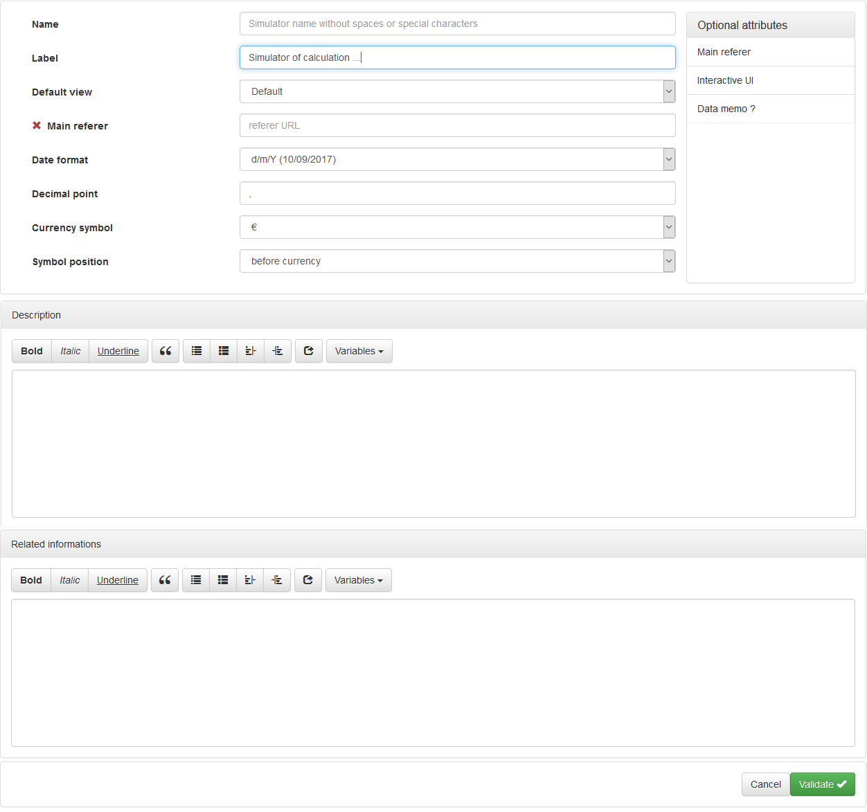
Attributes:
- « Name »: This is the name that will be displayed in the URL (* .../calcul/simulator-name *) and the .XML file created when the simulator was registered.
The simulator will be saved as
.xml in the G6K simulator directory. - « Label »: Title that will be displayed on the page of your simulator.
- « Default view »: View with which your simulator will be displayed. The view is a set of templates and styles used to display the simulator. For more information on views, see the Views management page of the documentation.
- « Date format »: To be selected according to the format of display and the most commonly used dates in the country.
- « Decimal point »: To be selected according to the display format of the numerical values (amount, percentages, ...) desired.
- « Currency symbol »: To be chosen according to the country.
- « Symbol position »: To be chosen according to the country.
Optional attributes:
- « Main Referer »: URL of the site page that calls the simulator. G6K constructs a navigation line where the penultimate element is constructed with this URL and the label of the simulator.
- « Interactive UI »: If this option is checked, the simulation engine will use Javascript to give interactivity to the simulation (recommended)
- « Data Memo »: If this option is checked, the simulation engine will be allowed to save the value of certain fields in the browser cookies for later use. Useful for a value like date of birth.
Describe what your simulator does in the « Description » field. This description will be displayed below the simulator label/title of all pages/simulation steps.
Optionally, you can enter additional information in the « Related Informations » field that the view template will display or not.
When you have finished entering the parameters and clicking on the button  , the
, the  button appears at the top right of the page.
This button allows you to send the entered or modified information to the server at any time, because the « Validate » button only keeps the information in the memory of your computer.
button appears at the top right of the page.
This button allows you to send the entered or modified information to the server at any time, because the « Validate » button only keeps the information in the memory of your computer.
Used data sources
In the « Used data sources » fold-out panel you will be able to define the specific requests for access to the datasources reference data. Some of these queries may require parameters that must be defined in the « Data » panel beforehand.
In the title bar of the « Used data sources » panel, click the « Add » button to display the screen for selecting the source and defining a query:

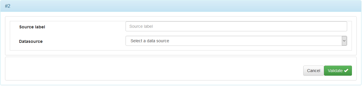
Attributes:
- « Datasource »: Corresponds to the data source to which the request relates.
Optional attribute:
- « Source label »: Title to be given to the source for this request.
Once the source is selected, the form completes the definition fields of the query.
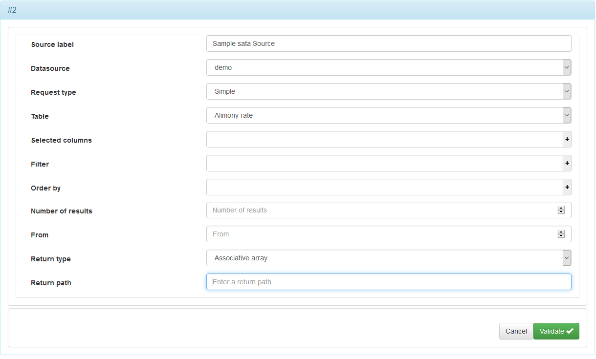
Simple query
A query is simple if it relates to only one table and does not have a nested subquery.
The form allows you to build simple queries without having to know the SQL language.
Attributes:
- « Request type »: The queries are either « Simple », that is, you are guided by the menu, or of type « Complex » in this case you will be free to type your queries with the SQL language. If the query is for a single table and does not have a nested query, choose the « Simple » type, otherwise choose the « Complex » type.
- « Table »: Name of the table to which the request relates.
- « Selected Columns »: Fields/columns of the table that contain the data you want to retrieve. To enter a column, click the '+' to the right of the field and select the column from the drop-down list. You can also compose an expression in which case you will need to define an alias as the column name. To delete a column, click the 'x' to the left of the column name.
- « Filter »: Requirements for fields/columns to keep only the rows of the result of the query complying with these conditions.
- « Order by »: Sort in ascending or descending order on the selected fields/columns. To enter a column, do as in & nbsp; 3., And then select the sort order (ascending or descending).
- « Number of Results »: Include the number of rows that should be retained among all « rows » of results returned by the query. Set 0 if all lines are to be retained.
- « From »: From all « rows » of results returned by the query, indicate the number of the first line that must be taken into account for processing the query. The number of the first line is 0, 1 the second and so on.
- « Return type »:
- « JSON »: format for the exchange of data in readable text.
- « XML »: format of description of the data.
- « Single value »: N/A.
- « Key / value pairs »: Table of key / value pairs.
- « HTML »: data format designed to represent web pages.
- « CSV »: open computer format representing data in comma-separated values.
- « Return path »: The path depends on the format of the data being returned:
To construct the query, refer to the Visual Component Manufacturing Simple Queries documentation
If the query contains a variable parameter, you must first declare a data (see « Data » section below) which will contain the value of the parameter.
Then, validate the entry without entering the filter at first. Click on the « Edit » button. The  button appears at the bottom right of the form to allow you to declare the parameter.
After you declare the parameter, you can enter the filter and select the parameter of the expression.
Parameter attributes:
- « Name »: Parameter name without spaces or special or accented characters.
- « Provenance »: Origin of the parameter either « Data » or « Constant ».
- « Data »: The name of the data you are going to work with.
Optional attribute of parameters:
- « Optional »: Optional parameter or not. A parameter can only be optional if it is used by a request to a « Web service » data source
Figure 1: Data source with a simple query and parameter
Once the input is validated, the following screen is displayed:
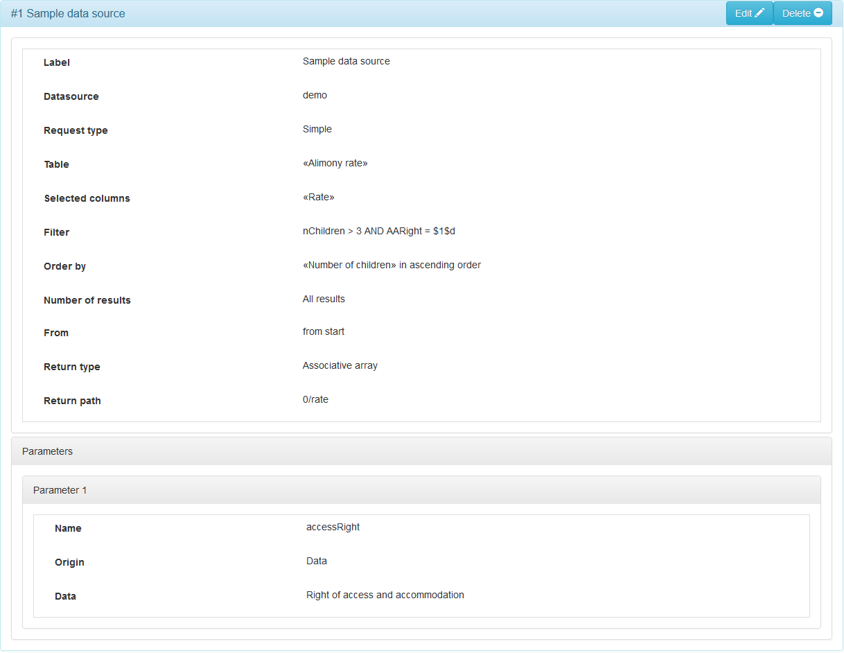
This query will return an array of « 'rate'/rate value » pairs. The specified return path (0/rate) will select the first row of the array and the value corresponding to 'rate'. We will see later how to declare a data to store the value of the rate.
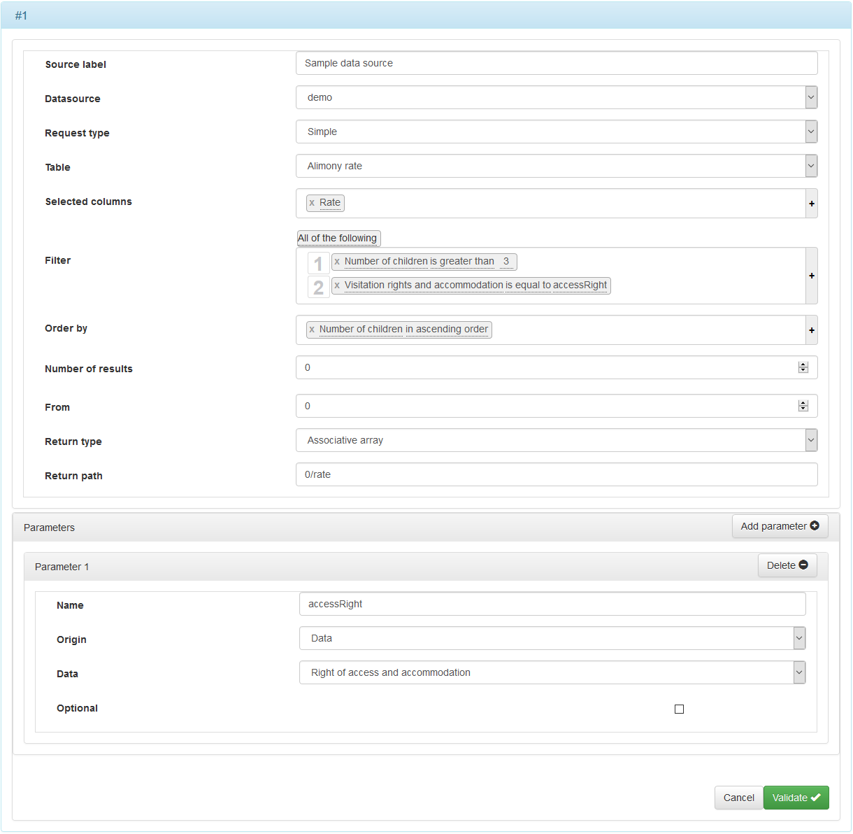
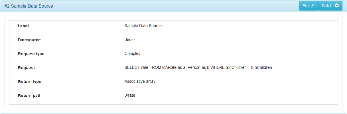
Complex query
In this case, the fields « Table », « Selected Columns », « Filter », « Order by », « Number of Results » and « From » are replaced by the « Request » field since those elements are contained in the request.
As with simple queries, parameters can be used.
The forms $X$d where X is the number of the parameter, refer to integer values, $X$f to decimal values and $X$s to alphanumeric values.
Attributes:
- « Request type »: Choose the « Complex » type.
- « Request »: The SQL request.
- « Return type »:
- « JSON »: format for the exchange of data in readable text.
- « XML »: format of description of the data.
- « Single value »: N/A.
- « Key / value pairs »: Table of key / value pairs.
- « HTML »: data format designed to represent web pages.
- « CSV »: open computer format representing data in comma-separated values.
- « Return path »: The path depends on the format of the data being returned:
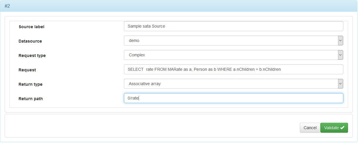
Figure 2: Data source with complex query
Data
The data allow to store values whatever their origin (user input, data source, element or result of calculations). They can be grouped into groups of data, allowing them to be arranged in the rows of a table (see « Grid layout » for a group of fields later in this document).
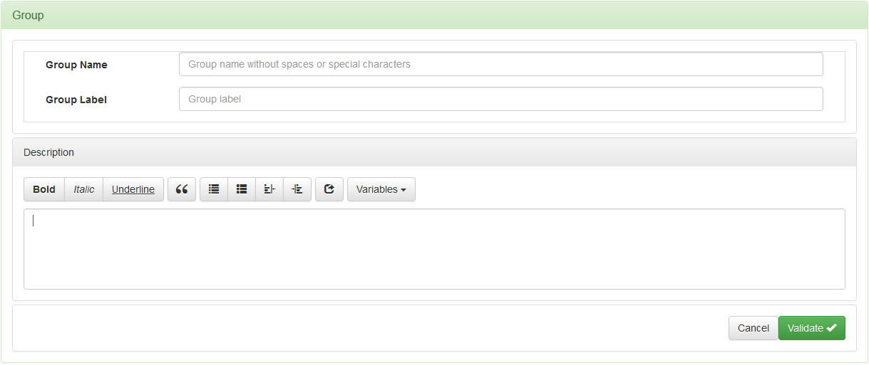
To add a data or a data group, click « Add » in the title bar « Datas »:

then click « Add data » or « Add datagroup » depending on the case:

Figure 3 : Form for adding a data group
Attributes:
- « Group Name »: Name of the data group without spaces or special or accented characters.
- « Group Label »: Title of the data group that can be selected when defining fields groups of the step, business rules, or profiles.
Give a description of the data group in the "Description" field.
Figure 4 : Form for adding a data
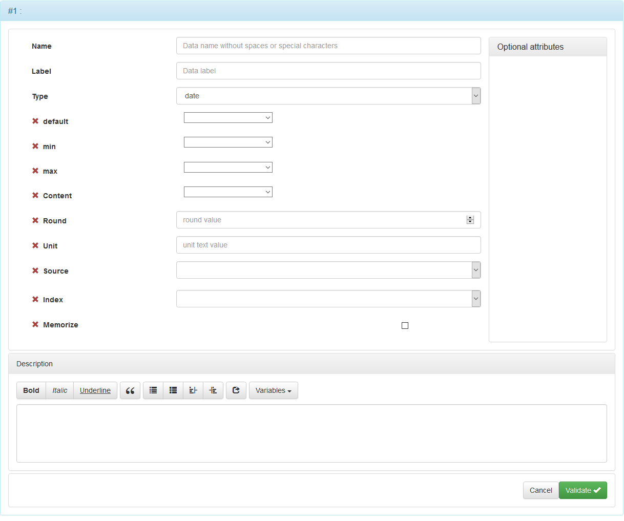
Attributes:
- « Name »: Name of the data without spaces or special or accented characters.
- « Label »: Label of the data that can be selected in the step fields, in the profiles.
- « Type »: Type of data. See Data type below.
Data type
| Type | Description |
|---|---|
| date | Date in the format defined in the simulator options. See supra. If the data is associated with an input field, a date picker will be proposed to the user. |
| day | Day number from 1 to 31. |
| month | Number of months from 1 to 12. |
| year | Year in 4 digits. |
| boolean | Boolean value (0/1). If the data is associated with an input field, a check cache will be offered to the user. |
| integer | Integer value. |
| number | Decimal value with decimal point. |
| text | Alphanumeric value. |
| textarea | Alphanumeric value with enrichment (bold, italic, underline, ...). |
| money | Monetary value to 2 decimals. |
| choice | Value that can be selected from a drop-down list or with radio buttons. |
| multichoice | Values selected using check boxes. |
| percent | Percentage from 0 to 100, possibly with decimal values. |
| array | List of values. Can not be used for input. |
| table | Table of values. Can not be used for input. |
| department | Department code. If the data is associated with an input field, the user chooses from a drop-down list. |
| region | Region code. If the data is associated with an input field, the user chooses from a drop-down list. |
| country | Country name. |
Optional attributes:
- « Default »: Default value of the data.
- « Min »: The minimum value of the data for numeric data.
- « Max »: The maximum value of the data for numeric data.
- « Content »: Unconditional expression to be assigned to the data. For the composition of the expression, refer to Composition of expressions.
- « Round »: Can be used with « Decimal Number » data. Allows you to set the decimal place after the decimal point. The last decimal place is rounded.
- « Unit »: Characterizes a numerical value such as "miles", "liters", "ampere", etc. The unit is displayed after the field.
- « Source »: If the data is to be supplied by a data source defined in the "Used datasources" panel.
- « Index »: Corresponds to the field returned by the request to supply the data.
- « Memorize »: Keep in memory (user's cookie) the value so that the user does not have to re-enter it (see attribute « Memo » of the simulator)
Give a description of the data in the "Description" field. This description can be displayed in a tooltip at the request of the user.
In the case of "choice" data, you have to indicate how to feed the list of choices, for this a « Choices » panel is displayed at the bottom of the entry form:

The list is either static, ie its elements appear in extenso in the definition file of the simulator, or dynamic, ie it is filled by a data source
To create a static list, click on the "Add choice" button in the "Choices" panel:
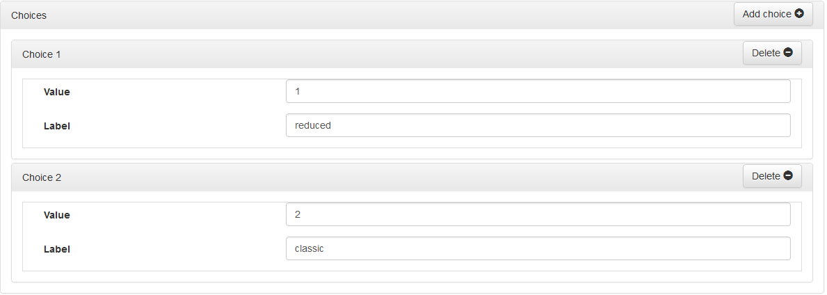
Attributes:
- « Value »: The value assigned to the data if this list item is selected.
- « Label »: The text of the item that appears in the list.
Add choices as many times as necessary to constitute the list.
To create a dynamic list, click the "Add source" button:
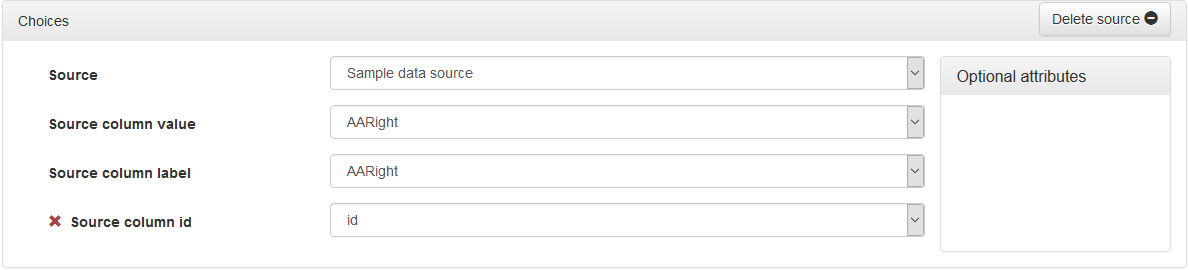
Attributes:
- « Source »: Source of the data to feed the list.
- « Source column value »: The field containing the value assigned to the data item if this list item is selected.
- « Source column label »: Field containing the text of the element appearing in the list.
Optional attribute:
- "Source column ID": The field containing the element ID.
Steps
Once you have defined your data sources and data you will be able to start setting up the step(s) of your simulator.
A step consists of one or more panels in which are arranged information blocks and groups of fields in the order in which they are declared.
The information blocks are composed of chapters, themselves composed of sections.
Field groups are composed of fields that can be arranged in three different ways:
- « Classic »: The fields and their labels are displayed in a classical way, that is to say one below the other.
- « Grid »: The fields are arranged in rows in the form of tables. The data associated with the fields in a row must be grouped into « data groups » (see below). Field labels are ignored.
- « Online »: The fields and their labels are arranged one after the other in order to form a sentence.
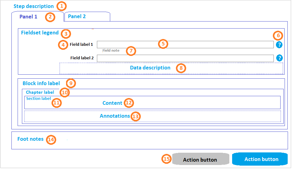
These elements are arranged as follows in the page of a step:
To add a step, click the « Add » button in the title bar of the « Steps » panel:

The entry form for a step is displayed:
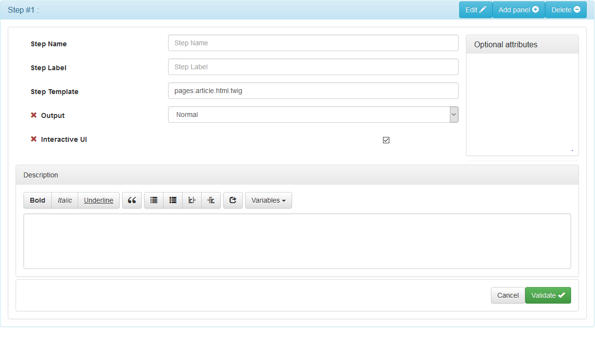
Attributes:
- « Step Name »: Name of the step without spaces or special or accented characters.
- « Step Label »: Title of the step that will be displayed in the breadcrumb trail.
- « Step Template »: Name of the template used by G6K to display the page of the step. For more information, see: View Management
Optional attributes:
- « Output »: « Normal », « Inline PDF », « Downloadable PDF » or « html ». See the description of these values below.
- « Interactive UI »: If this option is checked, the simulation engine will use Javascript to give interactivity to the simulation for this step (recommended).
| Output | Description |
|---|---|
| « Normal » | The step is displayed normally. |
| « Inline PDF » | G6K displays a PDF rendering of the generated page. |
| « Downloadable PDF » | G6K generates a PDF file of the rendering of the page to be downloaded. |
| « html » | Reserve. Not implemented |
Describe the step in the « Description » field. This description is displayed in the area 1 of the page.
Panels
The panels compose the steps and are themselves made up of groups of fields. If there are several panels, they will be presented in the form of tabs:
To add a panel, click the « Add » button in the title bar of the « Steps » panel:

then click « Add Panel » in the menu:
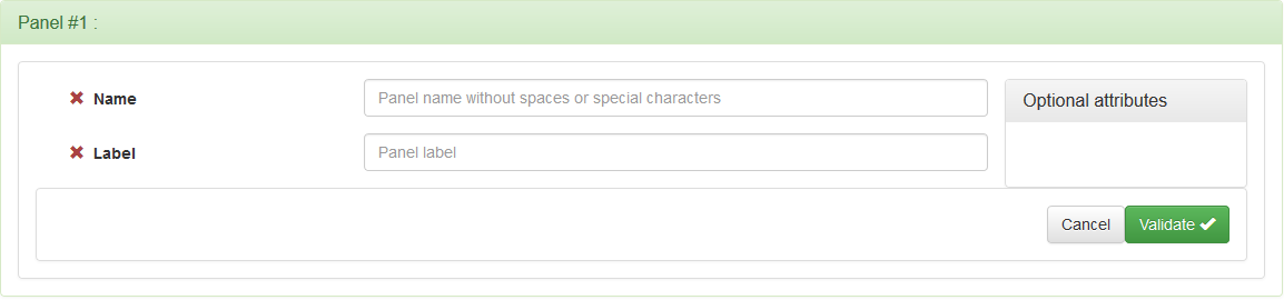
Attributes:
- « Name »: Name of the panel without spaces or special or accented characters.
Optional attribute:
- « Label »: Panel label. It appears in the area 2 of the page.
Fieldset
Fieldset makes it possible to group together fields of the same nature (logical or thematic) thus highlighting the structuring of the information requested.
To add a fieldset, click the « Add » button in the title bar of the "Panel" panel:

then click « Add fieldset » in the menu:
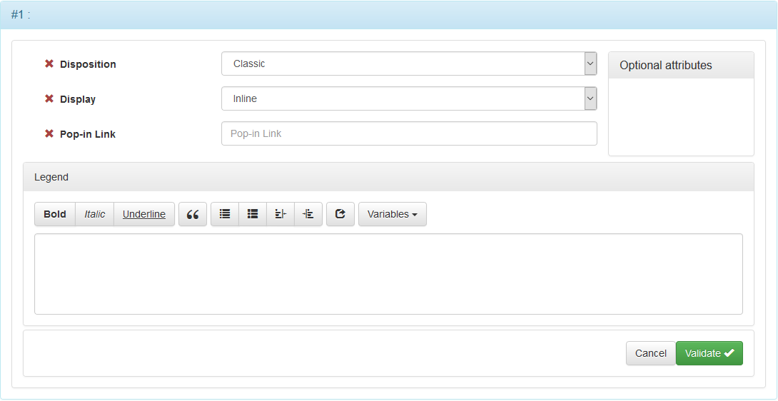
Attributes:
- « Disposition »: « Classic », « Grid » or « Inline ».
- « Display »: « Inline » or « Pop-in ».
| Disposition | Description |
|---|---|
| Classic | The elements of the form belonging to the group of fields are arranged in a conventional way, that is, a field preceded by its field label is placed on the line following that of the preceding field |
| Grid | Form elements belonging to the field group are placed in a table |
| Inline | The elements of the form belonging to the group of fields are arranged on line to form a sentence |
| Display | Description |
|---|---|
| Inline | The fields of the field group are displayed "online" in the page |
| Pop-in | Fields in the field group are displayed in a pop-in-modal window. A link whose label is in the "Pop-in activation link" attribute displays the |
Optional attribute:
- « Pop-in activation link »: This attribute is to be filled in only if the « Display » attribute of the field group is « Pop-in ». It's the text of the link that displays the pop-in.
Describe the fieldset in the « Legend » field. This legend appears in the area 3 of the page.
Fields
The field is the element of the form that allows the input or the restitution of a data. It takes the form of an entry box, a list box, a checkbox or radio buttons.
It is preceded by a field label unless it is placed in the cell of an array.
It may be mandatory or optional.
To add a field, click the « Add field » button in the title bar of the fieldset panel to which you want to add it:

The form for entering a field is displayed:
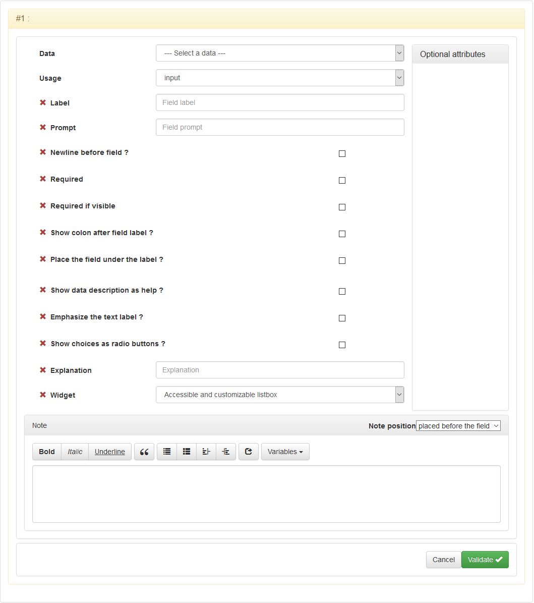
Attributes:
- « Data »: Data associated with the field. If it is an input field, it is in this data that the value entered by the user will be stored. If it is a field of restitution, it is the content of this data that will be displayed in the field.
- « Usage »: User input or restitution to the user.
Optional attributes:
- « Label »: Label of the field. See 4.
- « Required »: Required field (An error message will be displayed if the field is not filled in).
- « Show after the field label? »: If this box is checked, the ':' will be displayed after the label.
- « Use data description as help? »: If this box is checked, a question mark will be displayed after the field (see 6). If the user clicks on this question mark, the description of the data is displayed below the field as help text (see 8).
- « Prompt »: Text to be displayed in the input field to indicate the input format or what to enter or select.
- « Line jump before field? »: If this box is checked, the field will be displayed on a new line.
- « Required if visible »:If this box is checked, the field will be made mandatory if and only if it is not hidden.
- « Place the field under the field label? »: If this box is checked, the field will be displayed below its label and not to its right.
- « Highlight the field label? »: If this box is checked, the field label will be displayed in bold.
- « Show choices with radio buttons? » Do not use for long lists of choices.
- « Explanation »: Text explaining how the field is calculated.
- « Widget »: To be chosen according to your needs:
- « List box conforming to RGAA »: List box according to the General Repository of Accessibility for the Administration.
- « List box with auto-completion »: When entering the auto-completion is done automatically, this allows the user to find the item he is looking for.
- « Postal code obtained by self-completion on the name of the municipality or its postal code »: Allows the user to take advantage of the self-completion concerning the name of the commune or its postal code.
- « INSEE code obtained by self-completion on the name of the commune or its postal code »: Allows the user to benefit from the self-completion concerning the name of the commune or its postal code.
- « Insee code derived from a card of France»: A map appears and leaves the choice to the user to geolocate or not.
- « RGAA-compliant date selector »: Allows the user to select a date.
- « Form Field Editor »: Allows you to place an input field in the middle of a text.
Block of information
The blockinfo is an element of the simulation page of the same level as the field group but does not contain any input or output fields.
It contains textual information that can be useful to the user in the simulation process.
It can be contextualized by showing / hiding it totally or partially using the actions of business rules depending on certain conditions.
The blockinfos are composed of one or many chapters themselves composed of one or many sections.
To add a blockinfo, click the "Add" button in the title bar of the "Panel" panel:
then "Add blockinfo" from the menu:
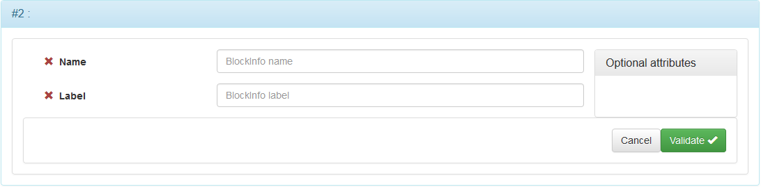
Optional attributes:
- « Name »: Blockinfo name without spaces or special or accented characters.
- « Label »: Blockinfo label. It appears in the area 9 of the page.
Chapter
The chapter is a subdivision of the Blockinfo. It is composed of sections.
It can be made foldable / unfoldable in the case of a block of information containing many chapters to facilitate the reading of the page.
It can also be associated with an icon to make it visually distinguishable from the other chapters.
To add a chapter, click the "Add chapter" button in the title bar of the « Blockinfo » panel:

The form for entering a chapter is displayed:
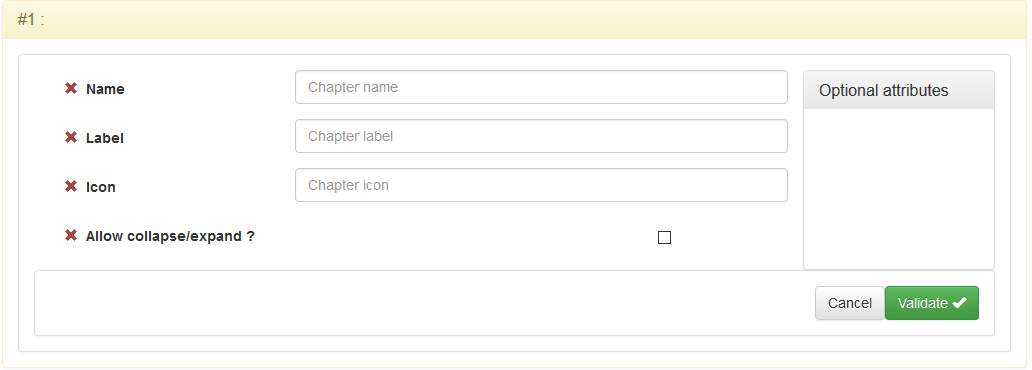
Optional attributes:
- « Name »: Name of the chapter without spaces or special characters or accented.
- « Label »: Title of the chapter. It appears in the 10 area of the page.
- « Icon »: Absolute or relative URL of an image.
- « Allow collape/expand »: If this box is checked, only the title bar of the chapter panel is displayed. By clicking on the title bar, the panel unfolds to show the contents.
Section
The section is a subdivision of a chapter. It is in the sections that the different texts of a block of information are inscribed.
The text of a section can be annotated.
To add a section, click the "Add Section" button on the title bar of the « Chapter » panel:

The form for entering a section is displayed:
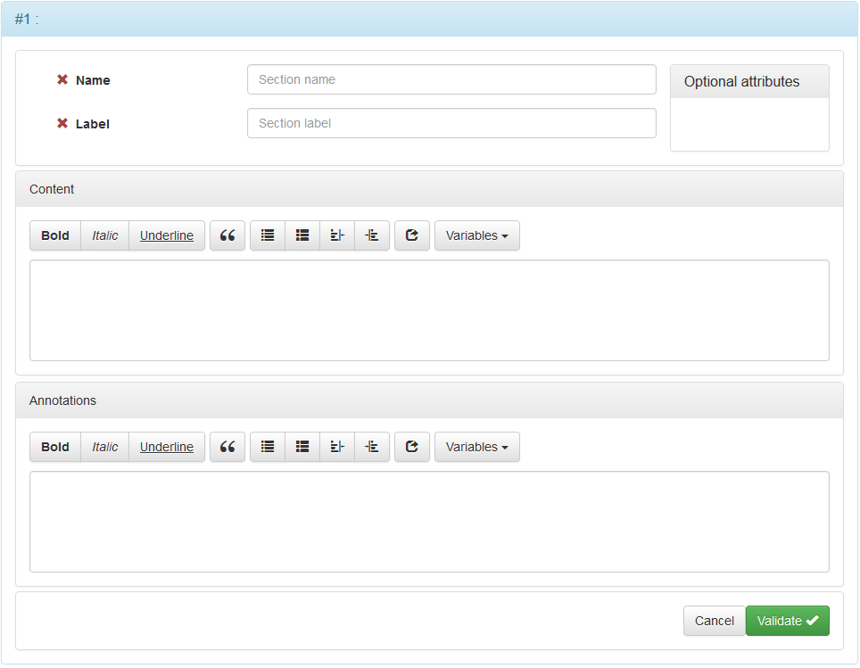
Optional attributes:
- « Name »: Name of the section without spaces or special or accented characters.
- « Label »: The label of the section. It appears in the 11 area of the page.
Enter the rich text of the section in the « Content » field of the form.
This content will be displayed in the 12 area of the page.
Optionally, annotations of the text can be added in the « Annotations » field.
These annotations will appear in the 13 area of the page.
Footnotes
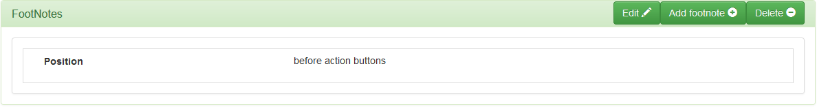
A footnote is a contextualized note (which can be shown or hidden by business rules) in the lower part of the form (14 of the page) of a simulation step.
The footnotes can be placed, at your convenience, before or after the action buttons.
To add footnotes, click the « Add » button in the title bar of the « Steps » panel:
then click « Add footnotes » on the menu:
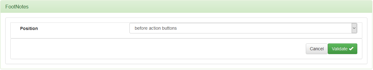
Choose their locations (before or after the action buttons) and validate.
Then click the « Add footnote » button in the title bar:
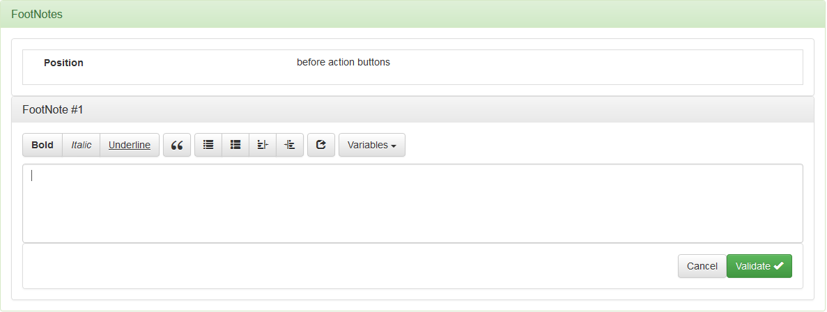
Enter the note then validate.
The number of notes you can add is not limited.
Action Buttons
The action buttons allow you to sequence the steps, reset a form, start a new simulation, or open a page outside the simulator.
They will appear in the 15 area of the page.
To add an action button, click the « Add action button » button in the title bar of the « Action Buttons » panel:

The button attributes input form is displayed:
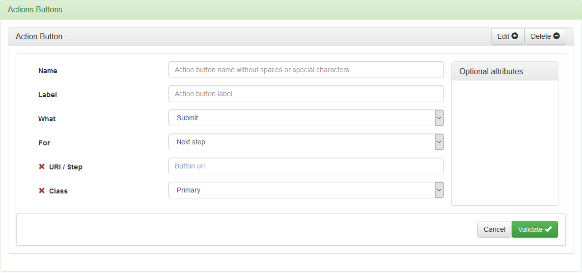
Attributes:
- « Name »: Button name without spaces or special or accented characters.
- « Label »: Button label.
- « What »: « Submit » if you want to go to the step defined by the attribute « For », « Reset » to reset (erase the data) the form.
- « For »: If the action chosen is « Submit », this attribute defines the sequence (next, previous, current or specific step), a new simulation or the opening of an external page.
Optional attributes:
- « URI / Step »: If the « For » attribute contains « External page », then this attribute contains the URI of the page. If the « For » attribute contains « Jump to step », then this attribute contains the number of the target step.
- « Class »: Level of importance of the « Main » button the button will be put forward visually and « Secondary » the button will not be put forward visually.
Business rules
Business rules are defined in the following way: « When ... » condition, « Then ... » actions and « Else ... » actions.

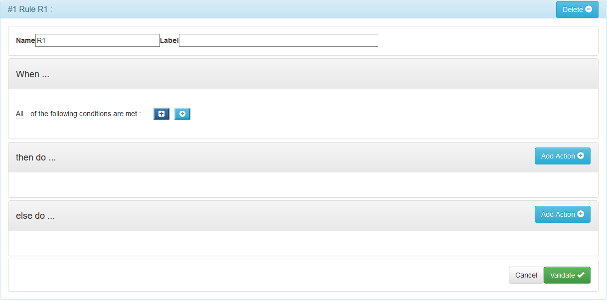
It is the « business rules » that determine the behavior of the simulator. They are triggered when the context changes.
A change of context always results in the acquisition or modification of data.
G6k inquiries about the context change by reverting the conditions associated with the rules when the value of a data changes.
Thus, when the user enters a value, g6K accesses a reference data or a value is calculated, the impacted rules are triggered and the associated actions are performed:
The actions that can be carried out are:
- Show or hide part of the page (a field, a fields set, a panel, a button, ...)
- Display an error or warning message
- Perform a calculation and assign it to a data
Refer to the Business Rules Composition page for how to compose a rule.
Profiles
When you define profiles, you will pre-define data related to the different profiles.
Profiles can correspond to types of people e.g. predefined data for a professional differ from pre-filled data of an individual.

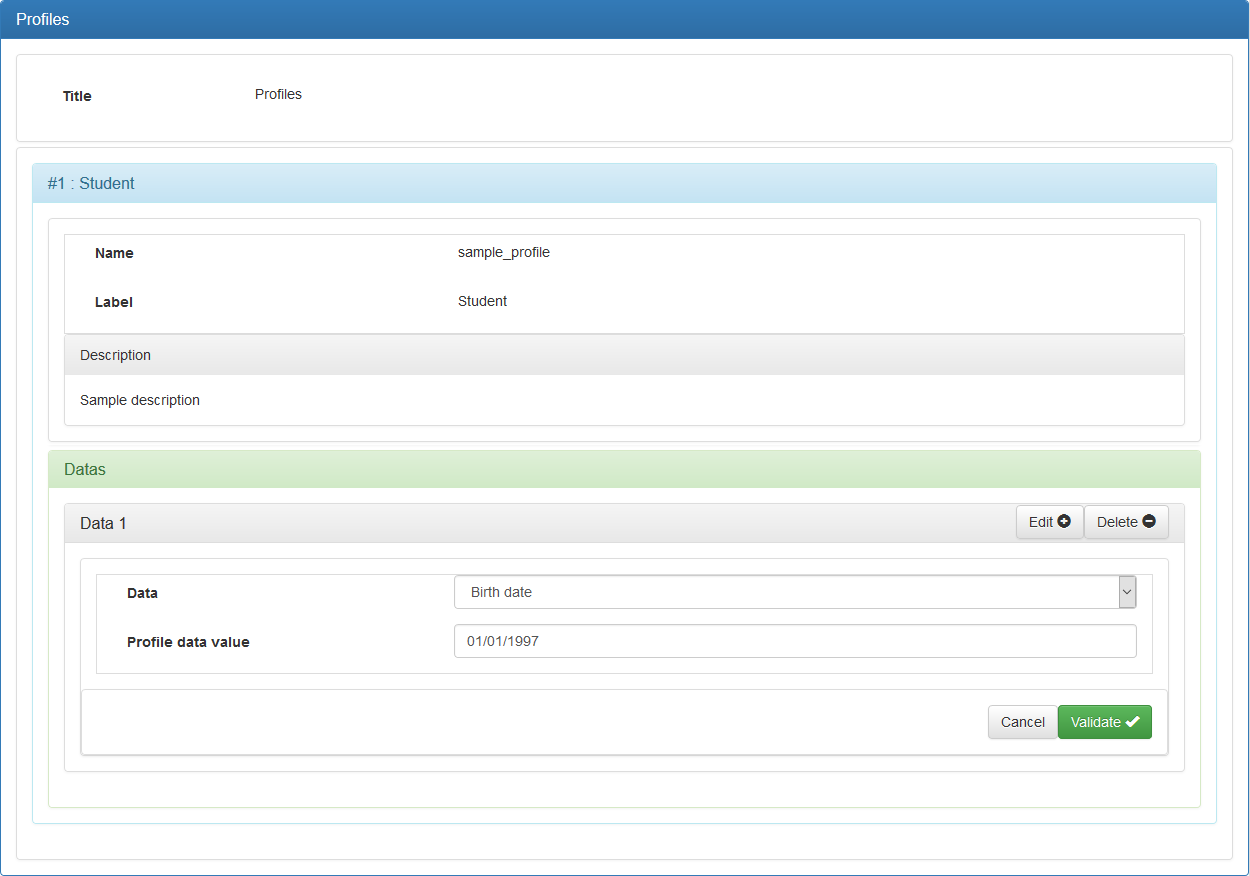
Attributes:
- « Title »: Title of your profiles.
- « Name »: Name of the profile.
- « Label »: The label of the profile.
- « Data »/« Add »: Add data to be filled in.
- « Data »: Choice of the data to be filled.
- « Value »: Pre-filled value.
Simulator registration
At the end of your entry, click the button at the top right of the page to save your work.
Note that G6K saves a version of « work » that it will be necessary to « Publish ».
Deploying on front-end servers
If, for security reasons, the back-office is located on a different server from those on which visitors are performing simulations, you will have to deploy your simulators on these front-end servers from the back-office.
To do this, G6K provides deployment functionality to copy each simulator from the back-office to the front-end.
To enable this feature, the system administrator must add an « deployment » entry to the parameters.yml file of the G6K instance installed on the back-office server:
Example of deployment settings:
# src/EUREKA/G6KBundle/Resources/config/parameters.yml

    deployment:
        localhost: cp -f {local.rootdir}/{local.file} /var/www/html/simulator/{remote.dir}/
        remotehost: rsync -a {local.rootdir}/{local.file} user@remoteserver/var/www/html/simulator/{remote.file}
In this example, the system administrator declared two front-end servers of virtual names « localhost » and « remotehost ».
In front of each virtual name is the command that G6K must launch to copy the simulator files via the HTTP server user. Of course, this user must have the rights to execute these commands.
Each command is launched as many times as there are files in the deployed simulator. These files are:
- The XML definition file of the simulator.
- The database files of internal SQLite data sources used by the simulator
- The DataSources.xml file describing the data sources
- Simulator css style files in each of the views where the simulator can be used.
So for the command of the virtual server « localhost » of the example, suppose that the back office is installed in the directory « /var/www/html/g6k », the front-end is installed in the directory « /var www/html/simulator » and that you want to deploy a simulator named « demo » that accesses an internal data source « demo.db » and that it can be viewed in the « Demo » and « Default » views. The command will be started five times by G6K:
cp -f /var/www/html/g6k/src/EUREKA/G6KBundle/Resources/data/simulators/demo.xml /var/www/html/simulator/src/EUREKA/G6KBundle/Resources/data/simulators/
cp -f /var/www/html/g6k/src/EUREKA/G6KBundle/Resources/data/databases/demo.db /var/www/html/simulator/src/EUREKA/G6KBundle/Resources/data/databases/
cp -f /var/www/html/g6k/src/EUREKA/G6KBundle/Resources/data/databases/DataSources.xml /var/www/html/simulator/src/EUREKA/G6KBundle/Resources/data/databases/
cp -f /var/www/html/g6k/src/EUREKA/G6KBundle/Resources/public/Demo/demo.css /var/www/html/simulator/src/EUREKA/G6KBundle/Resources/public/Demo/
cp -f /var/www/html/g6k/src/EUREKA/G6KBundle/Resources/public/Default/demo.css /var/www/html/simulator/src/EUREKA/G6KBundle/Resources/public/Default/
after replacing:
- {local.rootdir} by « /var/www/html/g6k/»,
- {local.file} successively by « src/EUREKA/G6KBundle/Resources/data/databases/demo.db », « src/EUREKA/G6KBundle/Resources/data/simulators/demo.xml », « src/EUREKA/G6KBundle/Resources/data/databases/DataSources.xml », « src/EUREKA/G6KBundle/Resources/public/Default/demo.css »
- {remote.dir} successively by « src/EUREKA/G6KBundle/Resources/data/databases », « src/EUREKA/G6KBundle/Resources/data/databases », « src/EUREKA/G6KBundle/Resources/public/Default »
{local.rootdir}, {local.file}, {remote.dir}, and {remote.file} are parameters that the system administrator must use to configure commands:
- {local.rootdir}: G6K back-office installation directory
- {local.file}: File to copy relative to {local.rootdir}
- {remote.dir}: The directory of the file to be copied relative to the G6K installation directory on the front-end server.
- {remote.file}: The file to be copied relative to the G6K installation directory on the front-end server.
To deploy a simulator, click on the « Deploy simulator » button in the title bar of the simulator panel and confirm in the dialog box that appears:
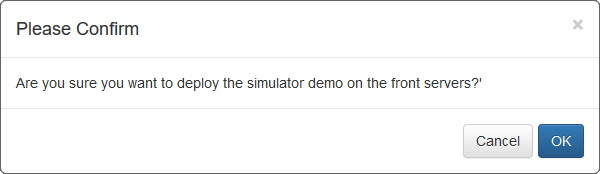
A deployment log is displayed. If a log line shows an error (in red), report it to the system administrator.
You must have the « Manager » role to deploy a simulator.